
Brushes and colours
Brush presets
A preset describes how a brush behaves: how strongly it reacts to pressure, whether its ends taper, whether it has a texture. Tap the preset name at the top of the pen or pencil panel to open the preset picker.
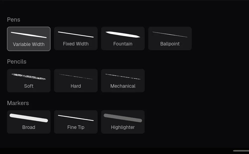
Tap a preset to use it. Kritzel Studio switches to the pen or pencil as needed and applies the preset’s width and opacity. Presets you picked recently appear in a row at the top of the picker during the current session.
Kritzel Studio comes with these presets:
| Category | Preset | Width | Opacity | Character |
|---|---|---|---|---|
| Pens | ‘Variable Width’ | 4 | 100% | All-round pen with pressure; the default |
| Pens | ‘Fixed Width’ | 3 | 100% | Constant width, ignores pressure |
| Pens | ‘Fountain’ | 5 | 100% | Strong pressure response, tapered ends |
| Pens | ‘Ballpoint’ | 2.5 | 100% | Thin, firm |
| Pencils | ‘Soft’ | 4 | 85% | Pencil grain texture, tapered ends; the default pencil |
| Pencils | ‘Hard’ | 2.5 | 90% | Pencil grain, finer |
| Pencils | ‘Mechanical’ | 1.5 | 95% | Pencil grain, constant fine line |
| Markers | ‘Broad’ | 16 | 90% | Wide, constant width |
| Markers | ‘Fine Tip’ | 3 | 100% | Fine marker |
| Markers | ‘Highlighter’ | 24 | 35% | Translucent, for highlighting |
Creating your own presets
Long-press a preset in the picker to open the preset editor. A preview stroke at the top shows the effect of each change.

| Setting | Effect |
|---|---|
| ‘Edge softening’ | Smooths the outline of the stroke. |
| ‘Streamline’ | Evens out shaky lines. Higher values make the line lag slightly behind the pen. |
| ‘Thinning’ | How much pressure changes the width. Negative values make the stroke thicker with less pressure. |
| ‘Pressure Curve’ | Maps stylus pressure to width. Drag the two control points or choose ‘Linear’, ‘Soft’ or ‘Firm’. |
| ‘Taper Start’ / ‘Taper End’ | Lets the stroke run out to a point at the start or end; ‘Length’ sets how long the taper is. |
| ‘Cap Start’ / ‘Cap End’ | Rounds the ends of the stroke. |
| ‘Brush Texture’ | ‘None’, ‘Pencil’, ‘Watercolor’ or ‘Spray’, with ‘Texture intensity’. |
Built-in presets cannot be changed. Tap ‘Save As New’ to store your settings as a new preset named ‘‹name› (Custom)’, which becomes the active preset. A custom preset can be changed later with ‘Save’ or removed with ‘Delete’. The editor does not change width and opacity; set those in the property panel.
Brush textures appear on the canvas and in PNG, JPG and PDF exports. SVG export, and PDF export with ‘Include textures & images’ switched off, draw textured strokes in a solid colour. ‘Vector Preview’ in the toolbar shows how that will look.
Favourite pens
Favourite pens are one-tap shortcuts in the tool rail. A favourite remembers the preset, colour, width and opacity.
- Tap the plus button below the tools to save the current pen as a favourite.
- Tap a favourite to switch to it.
- Double-tap a favourite to overwrite it with your current settings.
- Long-press a favourite and drag it to change the order. Drag it out of the strip to remove it.
Favourites are shared by all projects.
Choosing a colour
The ‘Color’ row in the property panel shows the current colour. Tap the round swatch to open the colour picker.
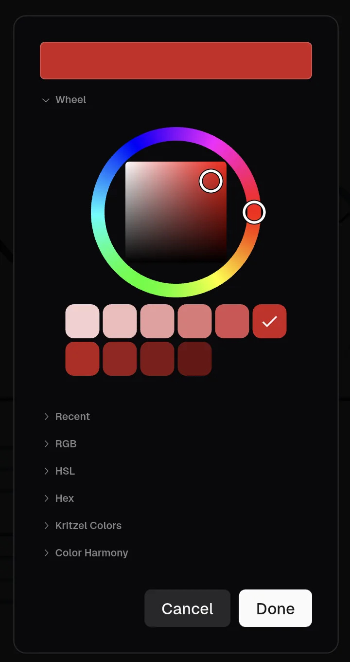
The picker has several sections you can expand and collapse:
- ‘Wheel’: choose the hue on the ring and saturation and lightness in the square. The swatches below offer lighter and darker shades.
- ‘Recent’: the last twelve colours you confirmed.
- ‘RGB’ and ‘HSL’: sliders for exact values.
- ‘Hex’: type a colour code such as
#3D7EA6. - ‘Kritzel Colors’: 24 ready-made colours.
- ‘Color Harmony’ and ‘Palette’, described below.
Tap ‘Done’ to use the colour. Transparency is not part of the colour; use the ‘Opacity’ slider in the property panel.
Colour harmony
Below the colour, the property panel suggests matching colours. Choose ‘Analogous’ (neighbouring hues), ‘Complement’ (the opposite hue), ‘Triadic’ (three evenly spaced hues) or ‘Mono’ (shades of the same hue), then tap a swatch to use it. ‘Add to Palette’ adds the suggestions to the active palette, or creates a new palette if you have none yet.
Palettes
Palettes are your own colour collections, shared by all projects. When you have at least one palette, it appears in the property panel below the harmony suggestions.
- Tap a swatch to use that colour.
- Tap the plus button to add the current colour.
- Long-press a swatch and drag it to reorder; drop it outside the palette to remove it.
- Choose another palette from the drop-down list above the swatches.
‘Manage Palettes’ opens a dialog where you create palettes (‘New Palette’), rename, duplicate, reorder and delete them.